The functional distribution of income
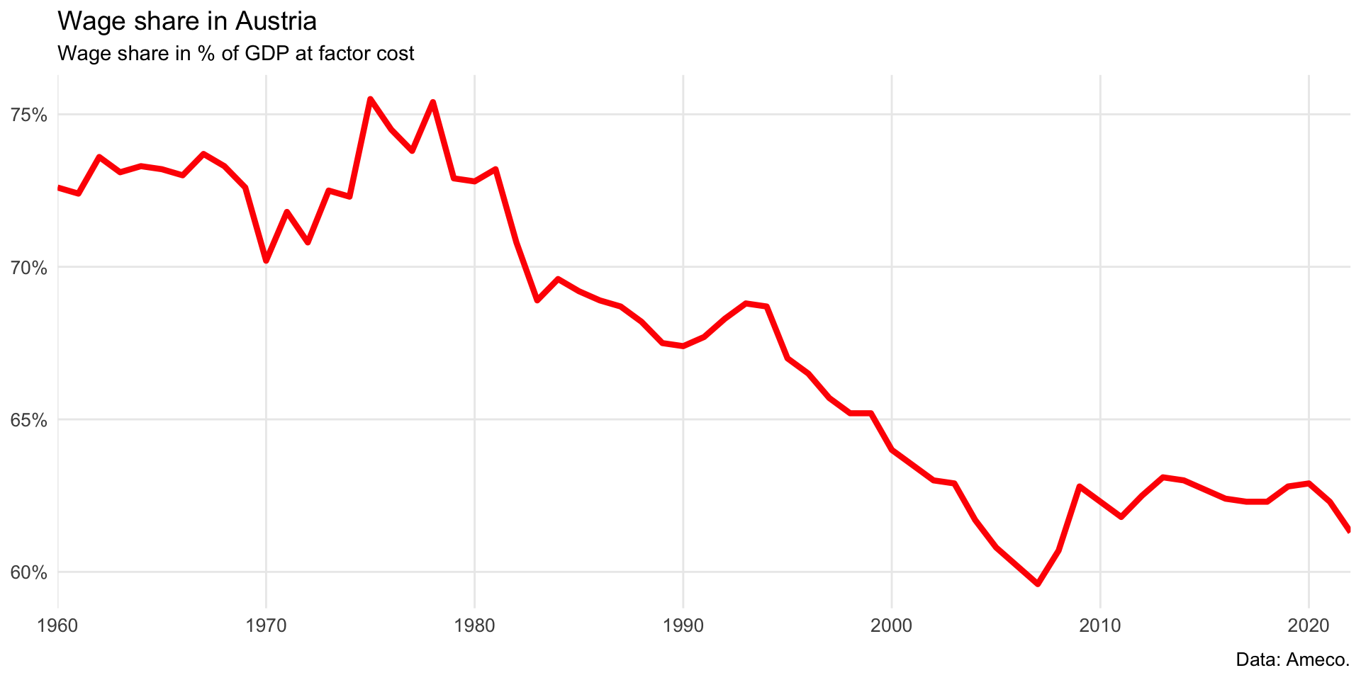
Wage share in Austria
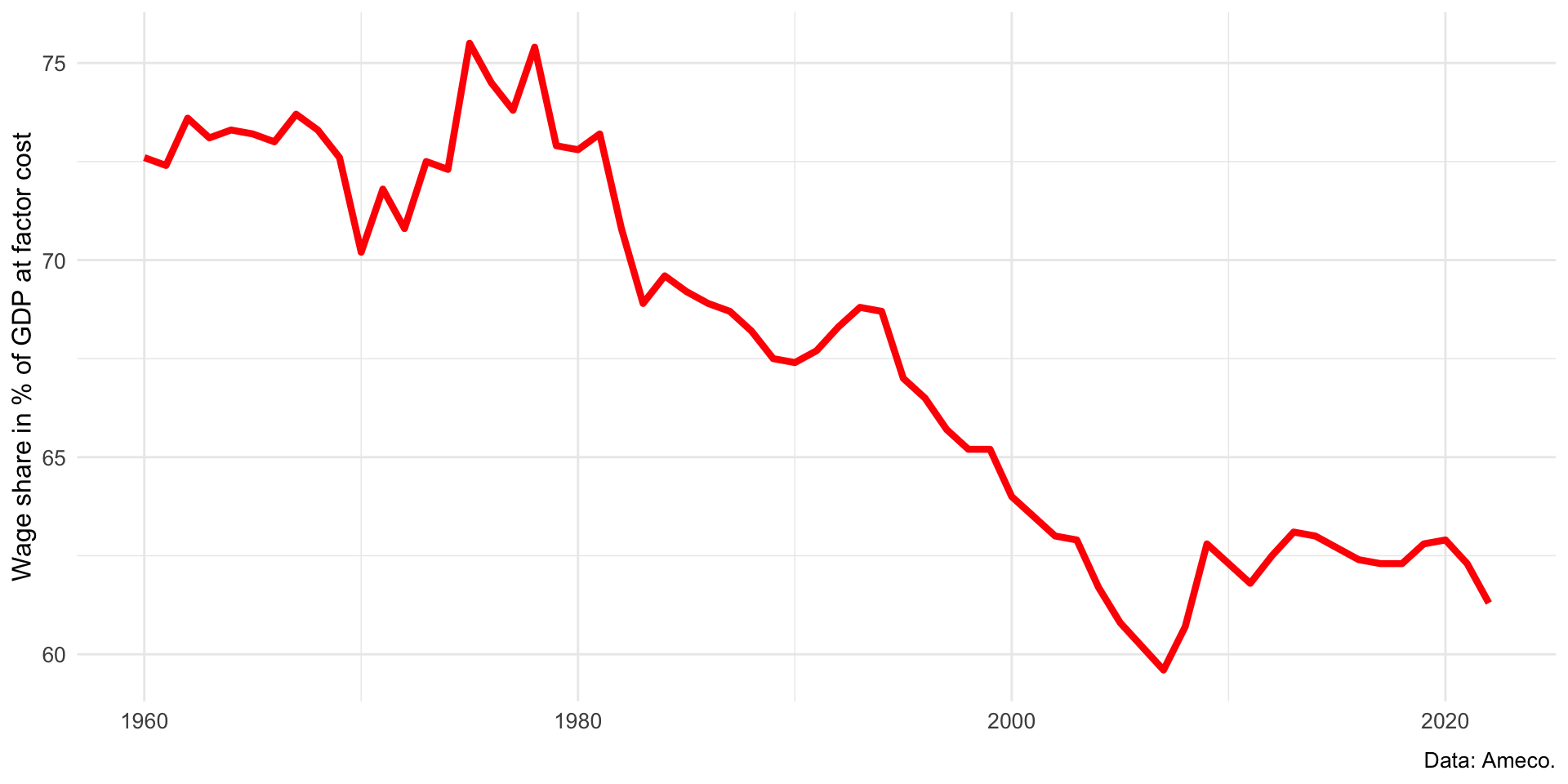
The wage share in Austria has been decreasing since the 1970s. In the wake of the global financial crisis that erupted in 2008, the wage share increased due to a sharp decline in profits.
We can improve the figure by editing the scales of the axes. We add percentage symbols to the y-axis and we remove the white space on the x-axis.
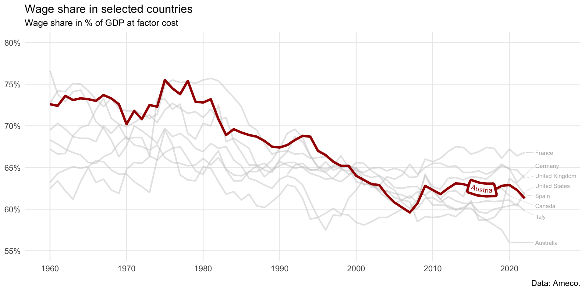
Wage shares in selected international countries
We can plot the wage shares for selected countries and emphasize the data for Austria with gghighlight. We can also improve the axis labels with scales.
Code for the figure
Here is the clean code for the figure on the functional distribution.
wsdata |>
  ggplot(aes(x = year, y = value, group = country, color = country)) +
  geom_line(linewidth = 1.4) +
  gghighlight(country == "Austria",
              unhighlighted_params = list(color = "gray80", alpha = 0.5, linewidth = 0.9),
              line_label_type = "label_path", label_key = country, use_group_by = F,
              label_params = list(size = 3, hjust = 0.94)) +
  geom_text_repel(data = wsdata |> slice_max(year, n=1, by=country) |> filter(!country == "Austria"),
                  aes(x = year, y = value, label = country),
                  xlim = c(as.Date("2023-01-01"), NA),
                  size = 2.5, color = "gray70", hjust = 0, direction = "y",
                  min.segment.length = unit(2, "pt"), segment.size = 0.1) +
  scale_color_manual(name = NULL, values = met.brewer("Austria"),) +
  scale_x_date(breaks= seq(min(wsdata$year),max(wsdata$year), by = "10 years"), date_labels = "%Y",
               limits = c(as.Date("1960-01-01"), as.Date("2026-01-01"))) +
  scale_y_continuous(limits = c(55,80), labels = scales::percent_format(scale = 1)) +
  labs(y = NULL, x = NULL, caption = "Data: Ameco.",
       title = "Wage share in selected countries", subtitle = "Wage share in % of GDP at factor cost") +
  theme_minimal() +
  theme(panel.grid.minor = element_blank(),
        plot.title = element_text(size = 14),
        plot.caption = element_text(size = 10, margin = margin(t = 1, unit = "lines")),
        axis.title = element_text(size = 12),
        axis.text = element_text(size = 10))