Economic Policy Visualization
Introduction
March 6, 2023
Course info

- Matthias Schnetzer
- Vienna Chamber of Labour & WU Vienna
- mschnetz@wu.ac.at
- https://mschnetzer.github.io
- matschnetzer
- Mar 6, 2023 – Jun 26, 2023
- 10:00–12:00
- TC.4.15
- https://mschnetzer.github.io/adveconpol
About this course
“A picture is worth a thousand words”
This course approaches contemporary issues of economic policy by analyzing innovative or iconic data visualizations. We analyse selected illustrations, discuss the underlying data, the theoretical background and policy implications. We will assemble plots in class and study the basics of data visualization.
You will gain:
- an overview of contemporary debates in economic policy
- a basic understanding of principles of data visualization
- knowledge how to enrich academic publications with informative graphs
Who are you?


What do you expect of this course? Do you already have some coding experience in R?
Schedule
| Date | Time | Room | Content | Assignment |
|---|---|---|---|---|
| Mar 06, 2023 | 10:00-12:00 | TC.4.15 | Introduction | |
| Mar 13, 2023 | 10:00-12:00 | TC.4.15 | Data | |
| Mar 20, 2023 | 10:00-12:00 | TC.4.15 | Visualization | |
| Mar 27, 2023 | 10:00-12:00 | D4.0.022 | Growth · Geometries | |
| Apr 17, 2023 | 10:00-12:00 | TC.3.07 | Inflation · Colors | |
| Apr 24, 2023 | 10:00-12:00 | TC.3.06 | Labour · Labels | |
| May 08, 2023 | 10:00-12:00 | TC.3.11 | Income · Scales | |
| May 15, 2023 | 10:00-12:00 | D4.0.127 | Wealth · Themes | |
| Jun 05, 2023 | 10:00-12:00 | D4.0.127 | Mobility · Maps | |
| Jun 12, 2023 | 10:00-12:00 | TC.3.07 | Climate · Facets | |
| Jun 19, 2023 | 10:00-12:00 | D4.0.127 | Student presentations | |
| Jun 26, 2023 | 10:00-12:00 | D4.0.127 | Student presentations |
Assignments
Assignment 1 provides the setup of the R infrastructure that is required in this course. There are no points for this assignment.
Assignments 2 to 4 are recreations of examplary figures. These examples are related to figures that are discussed in class. Students should then try to reproduce the plots at home and improve their individual coding skills.
The raw data for the figures are available as CSV files. The charts should then be uploaded to the learning platform before 9 a.m. on the day of the deadline.
Chart & Report
Chart presentation
- Research question Which economic policy question do you want to answer with your chart?
- Data
- Chart
- Conclusion What can we learn from the data visualization for economic policy?
Deadline: Date of the presentation
RMarkdown (or Quarto) Report
- Title
- Author
- Introduction
- Research question
- Data
- Result
- Conclusion
- Code
Deadline: June 30, 2023
Grading
Assignments: 30% (0-10 points for each visualization)
Chart presentation: 30% (0-20 points for the quality of the presentation, 0-10 for the preliminary chart)
Written report: 40% (0-40 points for the report and the final chart)
Feedback, cooperation and help
Let me know your feedback on the course anytime. If possible, I will try to incorporate your feedback immediately. At least, I will consider it for future courses.
As some of you might already have advanced coding skills in R, please support each other and collaborate. This does not mean that one person does all the coding and shares with all colleagues. Students should have an intrinsic motivation to improve their coding skills but cooperate to learn from each other.
There is a forum on the learning platform for exchange among students. Please also consult support platforms like Stack Overflow or take a look at the cheatsheets:
Recommended Literature
 |
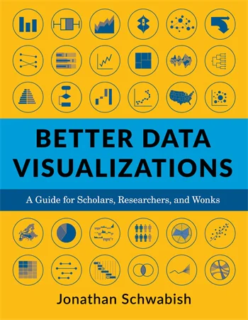
Jonathan Schwabish Better Data Visualizations: A Guide for Scholars, Researchers, and Wonks Columbia University Press ISBN-13: 9780231193115 |
 |
David Spiegelhalter The Art of Statistics: Learning from Data Penguin Books UK ISBN-13: 9780241258767 |

PI 5620 Advanced Economic Policy | Summer term 2023


